Xpresso

During Coursera's immersive Google UX Design course, I developed a Mobile Booking App prototype for a local Coffeehouse using the design thinking framework, Figma, and workflow developments.
Project Type
UX/UI | Product Design
Role
UX/UI Designer
Tools
Figma
Project Overview

Xpresso is a laptop-friendly local coffeehouse that is open 24/7.
It is designed to cater to:
- Domestic and international college students
- Young career professionals with diverse work and school schedules
The app includes a language setting that allows students to reserve a study room in advance in their native language, which eliminates the challenge of finding a place to sit and study without having to deal with a language barrier.

Challenge
- Users waste time going to a coffeehouse and not finding a place to sit and work. As a result, users don’t get work done, and their limited free time to do their work goes to waste.
- Communicating with staff is difficult due to a language barrier. As a result, non-English native speakers cannot reserve a study room/space.
Solution
- Creating a mobile app where targeted users can reserve a study room/space in advance, so they have peace of mind knowing they are guaranteed a place to sit and work before arriving at the coffeehouse.
- Include the ability for users to change the language so that non-native English speakers can reserve a study room without language difficulties.
Responsibilities
- User Research
- UX/UI Design
- Interaction Design
- Usability Testing
Understanding the User

To gain insight into addressing the user's needs for the booking, I conducted online and secondary research, built user empathy maps, and user perspective taking in an interview scenario.
Pain Points
- A lack of seating/rooms available for users to study and work on their laptops.
- Time, progress, and energy are wasted going to a coffee shop and not finding a place to sit and work.
- Many users face language barriers, preventing them from getting work done and feeling excluded from accessing services.
Personas
Christina Aguilar
“I enjoy getting coffee and food from coffee shops, especially when I bring my colleagues coffee and food. This unique experience makes networking with my colleagues easier. My colleagues treat me better, feel appreciated, and open up a pleasant conversation.”
Age
34
Occupation
Web Developer
Education
Bachelor's Degree
Hometown
Los Angeles, CA
Problem Statement
Christina Aguilar is a web developer for a large firm who needs to network with colleagues in a social-friendly environment to strengthen her work relationships and advance her career.
Goals
- Bring food items to colleagues as fast as possible.
- Networking for better career advancement with the firm.
- Ensure workers are working hard.
Frustrations
- Waiting and long lines.
- Lack of time to network with colleagues.
- No spaces available to socialize.
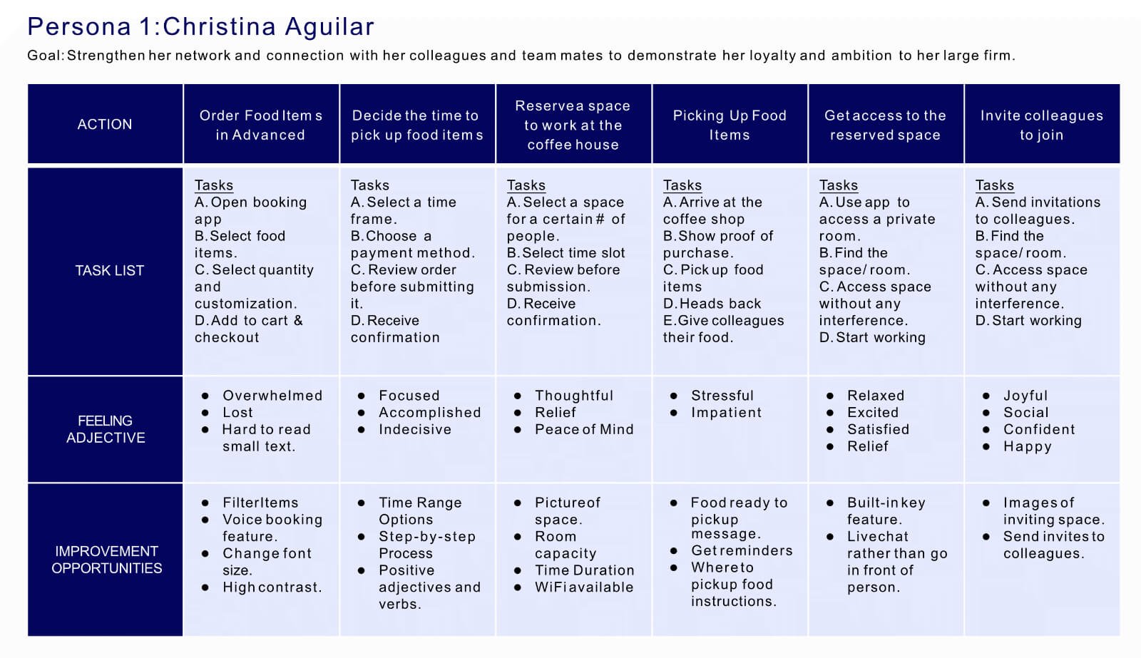
User Journey Map
Mapping Christina’s user journey reveals the convenience of using the local Coffeehouse's app to reserve study rooms.
Ali Akhtar
"Coffee shops help me be more creative and focused, and being in a coffee house doesn’t make me feel stressed. The library is dead quiet, and seeing everyone so stressed out makes me feel stressed and worried. Having a service where they speak your language makes life easier to navigate. It shows that they care about people whose native language isn’t English and that we matter as people."
Age
21
Occupation
Full time college student
Education
Currently in college
Hometown
Islamabad, Pakistan
Problem Statement
Ali Akhtar is an international college student who needs to reserve a space to study online in his native language because he has difficulties reading advanced English, and his proficiency in English is limited.
Goals
- Complete online classes on time without distractions.
- Save as much money as possible.
- Work/life balance.
Frustrations
- People speak too fast.
- App is not available in his native language.
- Writing is in advanced English.
- Tight budget.
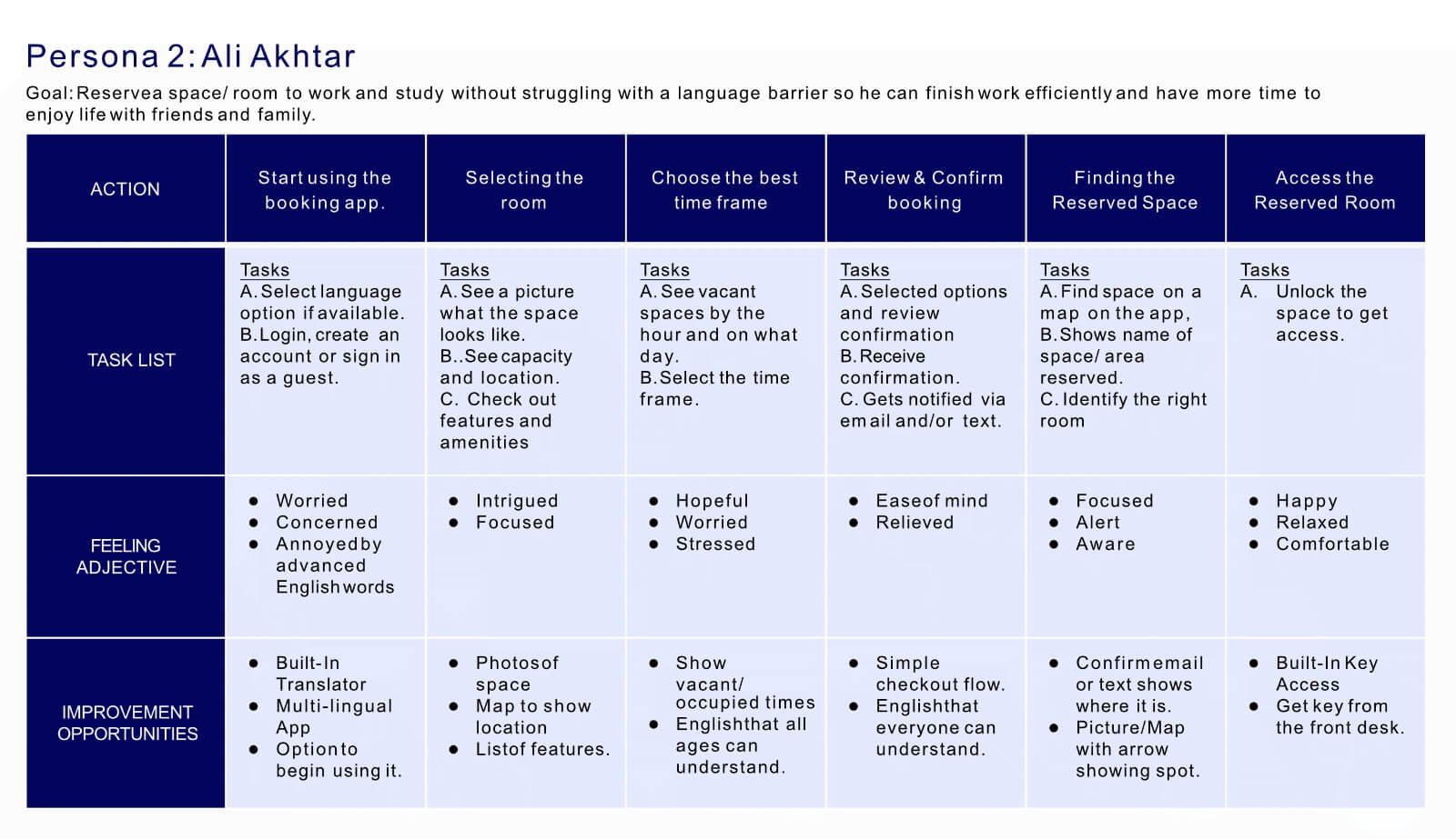
User Journey Map
Mapping Ali’s user journey shows how helpful it would be for users to use the local Coffeehouse’s reserve study room mobile app.
Starting the Design
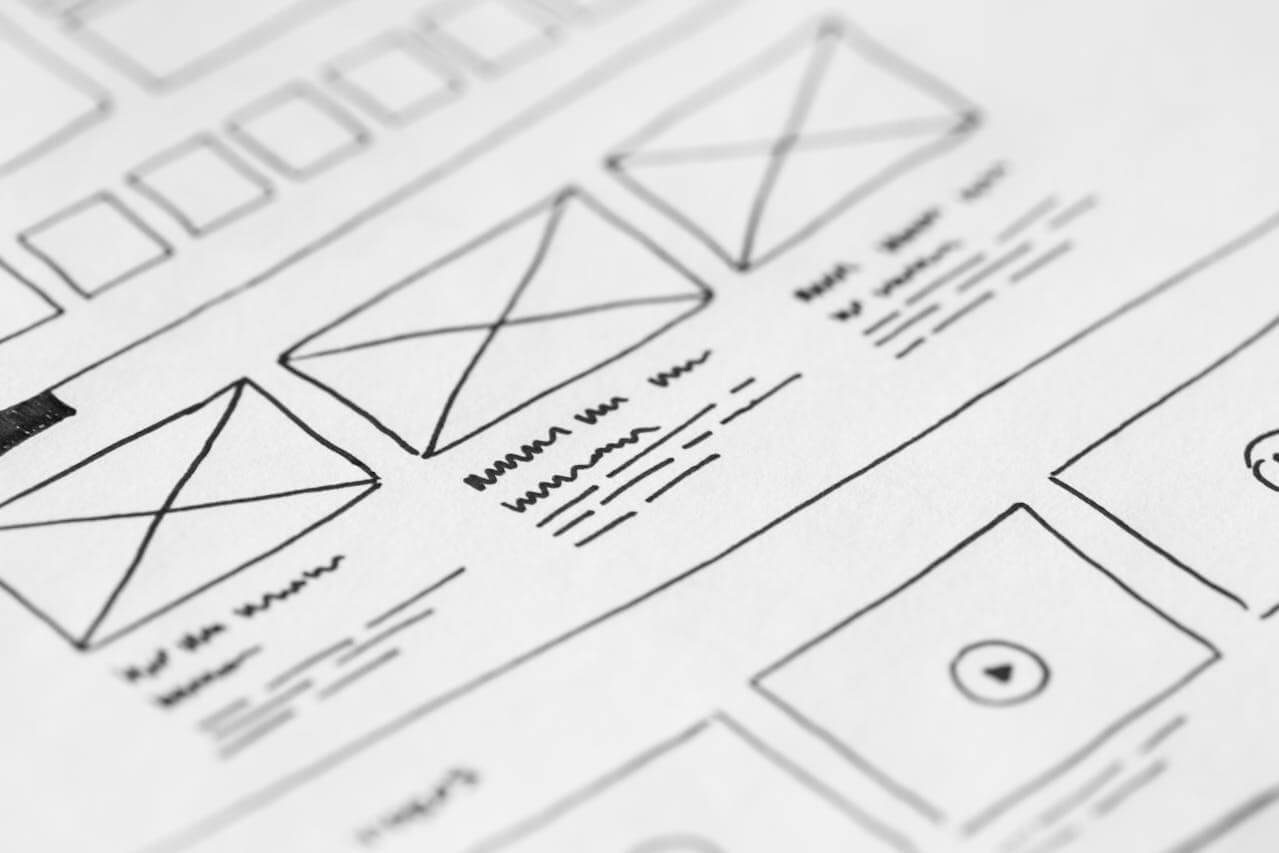
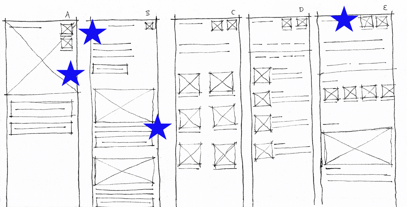
Paper Wireframes
With a strong focus on addressing the users’ pain points, I have meticulously organized the content within the wireframes.
This user-centric approach ensures that the elements on the home screen are structured to make the content more manageable and ease of use for different users.
Digital Wireframes
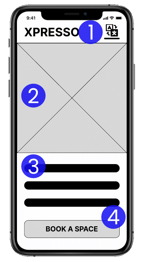
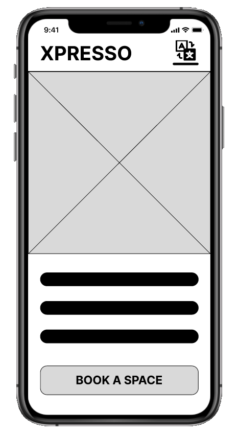
Homescreen
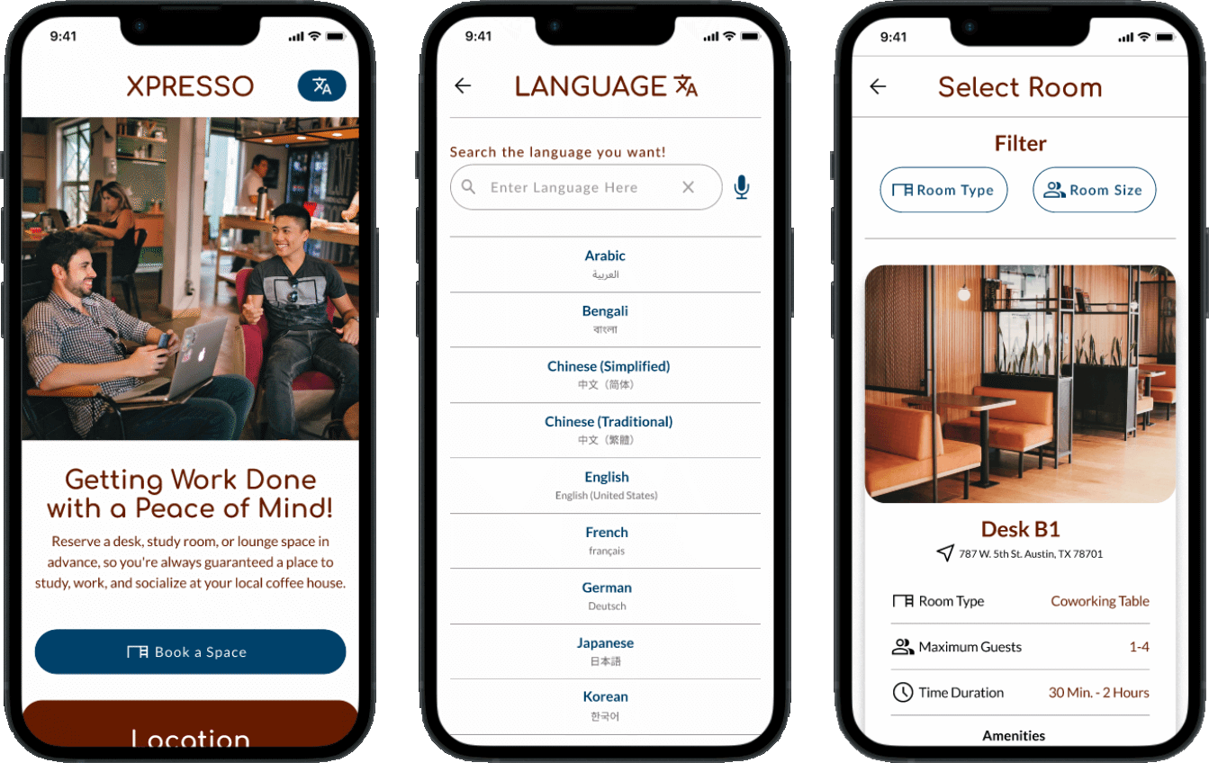
The elements on the home screen are intentionally designed to have a simple appearance so that users do not feel overwhelmed.
Short text descriptions are used, so all types of users can easily understand them without difficulties.
- The translator icon is visible, so users can quickly identify the language settings without searching for it.
- An image shows the targeted audience doing the task the user wants to do.
- Short and clear description.
- The Call-to-Action button is wide so, right- and left-handed users can easily press it.
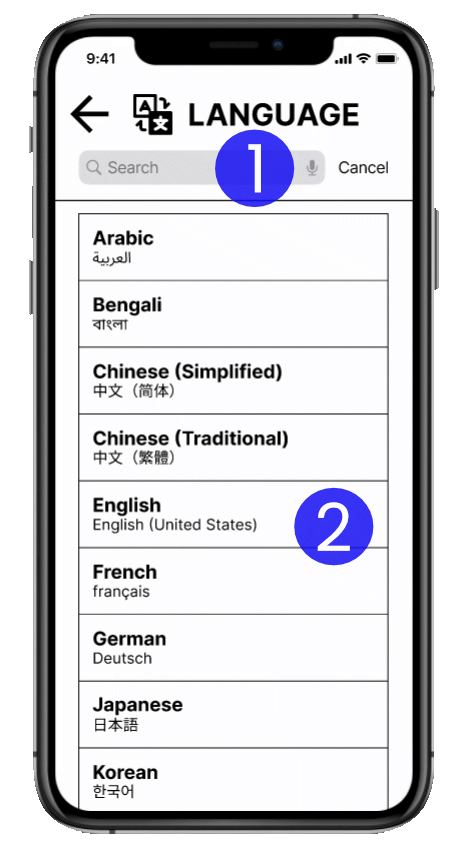
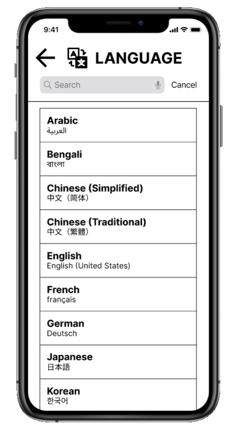
Language Settings
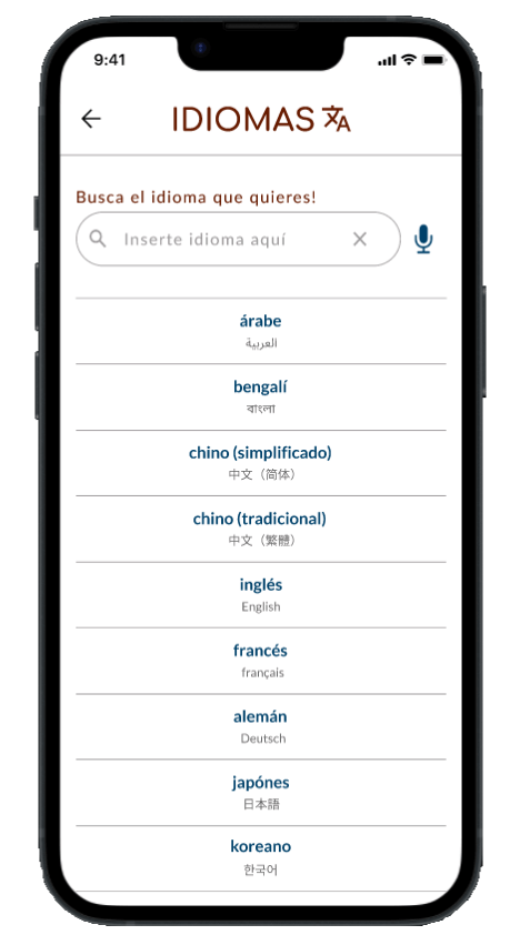
Language settings are essential for addressing language barriers by displaying language options in English and foreign languages, allowing anyone to use the app.
- A search bar helps users quickly find their language, making it easier for users to locate their desired language.
- The languages are displayed in both English and their native language.
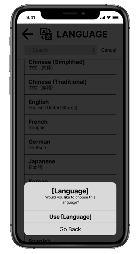
Confirm Language Choice
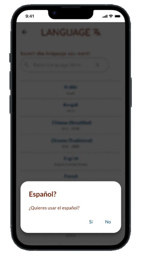
Once the user chooses a language, a pop-up screen will appear to confirm the selection.
This prevents unintentional selection of the wrong language, as the changes will not take effect immediately.
- The dark background behind the pop-up screens is purposely placed to help users focus their attention on the pop-up screen and confirm their selected language.
- Users can identify that they are still on the same language screen, ensuring they are not redirected to a different screen.
- Users can easily access the language pop-up buttons with just one hand, thanks to its placement at the bottom of the screen.
Low Fidelity Prototypes
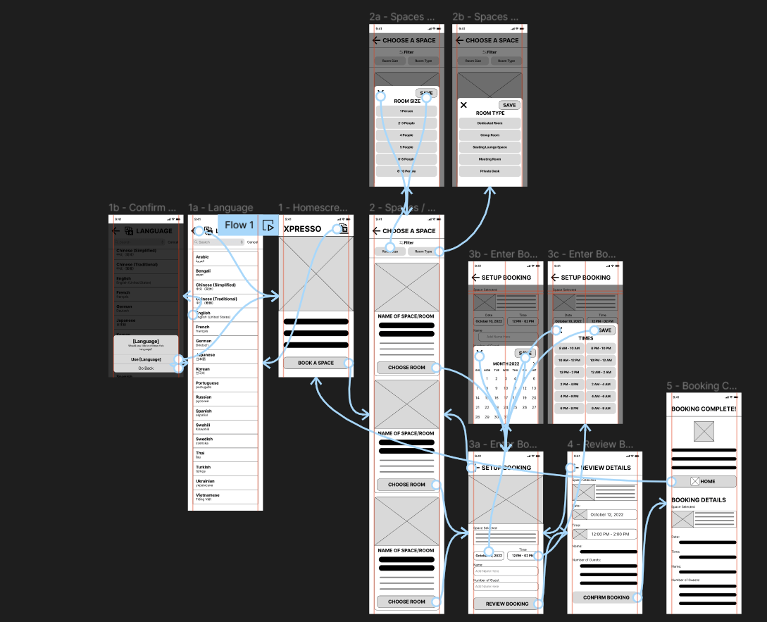
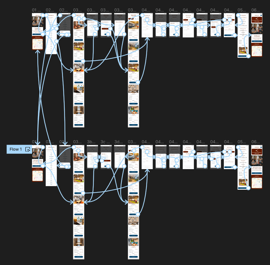
The low-fidelity prototype connected the primary user flow for changing the language and reserving a study space or room for a usability study.
Usability Study
Two usability studies were conducted. The first study utilized low-fidelity wireframes, with users providing input to enhance the design and improve the user experience for the mockups. The second study refined the mockups, resulting in a more polished booking app.
Findings
- Users express confusion with navigating the app.
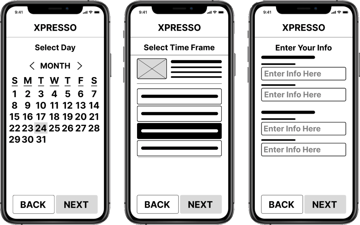
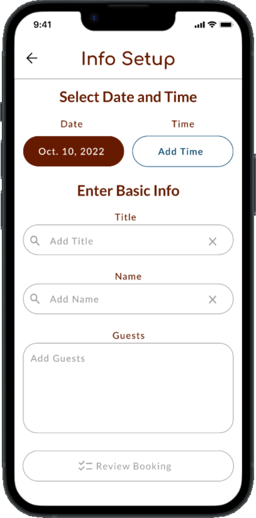
- Too many screens to complete booking a room/space.
- Users desire to know the location where the room/space is located.
Refining the Design
Mockups
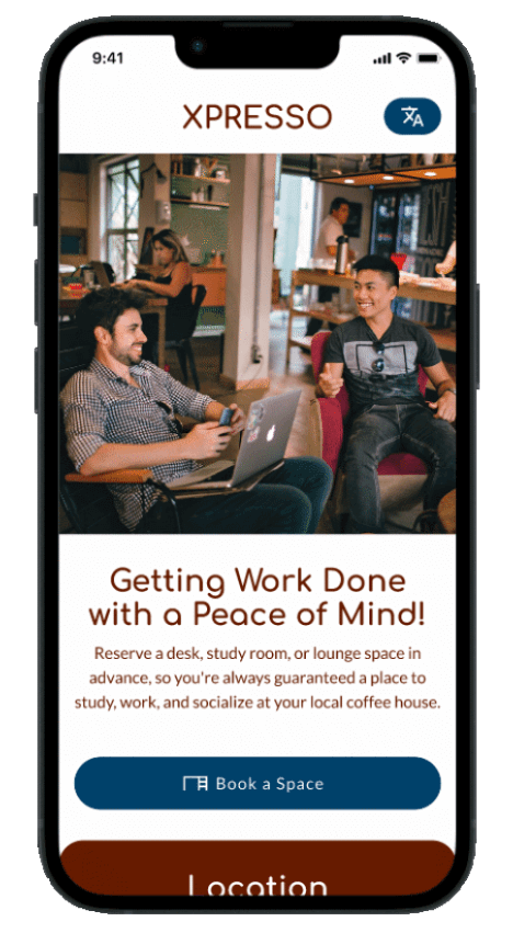
Home screen
The homepage is designed for simplicity. It has two call-to-action buttons in a single color, making it easy for users to identify them as buttons and take action.
The text is short and straightforward, so users can easily understand how the app helps them achieve their goals.
Before
After
Language settings
The language options are shown in both English and the respective foreign language, allowing both native and non-native English speakers to access and change the language without facing language barriers.
Before
After
Confirm language choice
The language confirmation popup appears to confirm the language before the language change takes effect, so users don’t accidentally select a language they don’t understand by mistake
Before

After
Less pages to complete task
Reducing the number of pages on the user flow to one page where the booking content is available on one screen will allow users to complete the booking process quickly without feeling overwhelmed.
Before
After
English Version

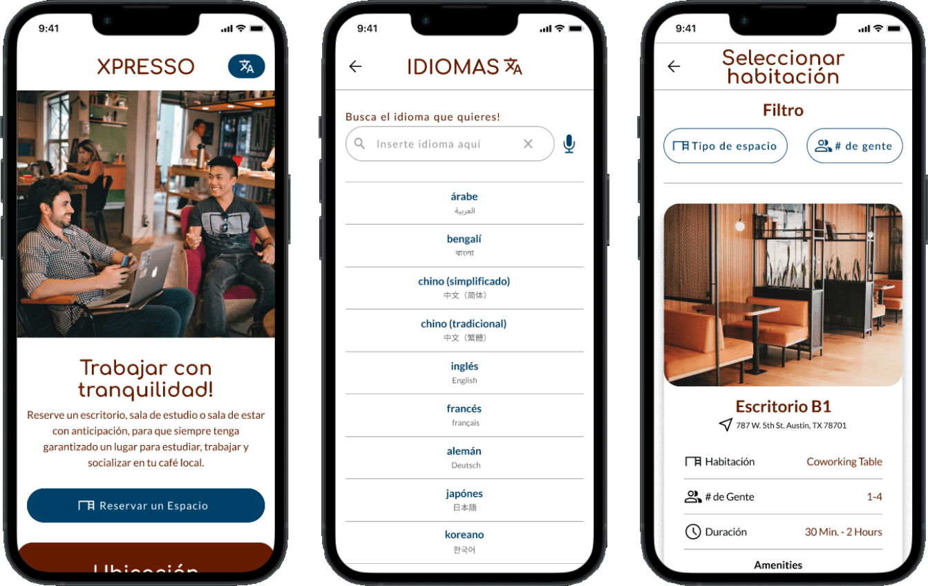
Spanish Version
High Fidelity Prototype
The final high-fidelity prototype presented a simple and effective user flow for reserving a study room. The app's language can be changed for different language speakers.
Accessibility Considerations

Provide accessibility features so more users can access the booking app, such as speech-to-text transcribing and talkback.
Larger font size option so users with low vision can easily read the text.
Using a professional translator to ensure the foreign language(s) is accurately translated to avoid miscommunication.
Going Forward
Impact
The booking study rooms app makes users feel like their needs matter, especially for people with limited English proficiency and who deal with language barrier issues daily.
What I've Learned
Users play a crucial role in shaping the app's development at every stage of the design process.


